Campaign For Good
Client: School Project — Myers School of Art: Typography III
Date: Fall 2020
Techniques used: Adobe InDesign and Photoshop
Role: Designer
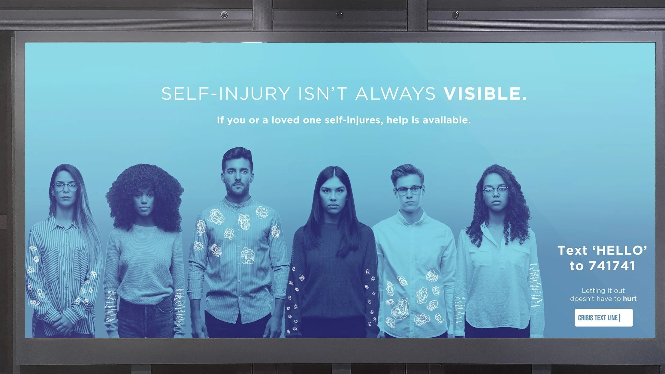
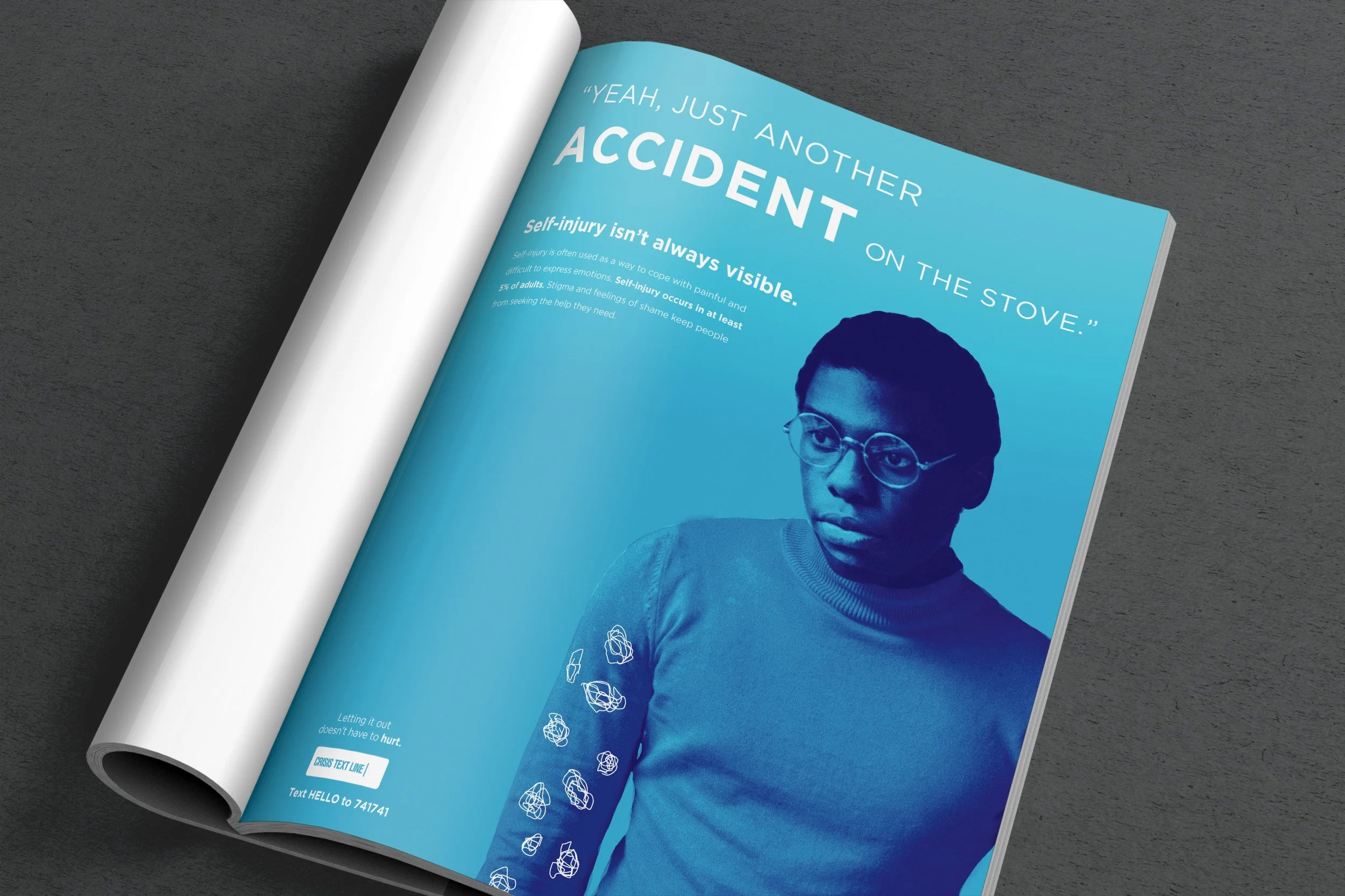
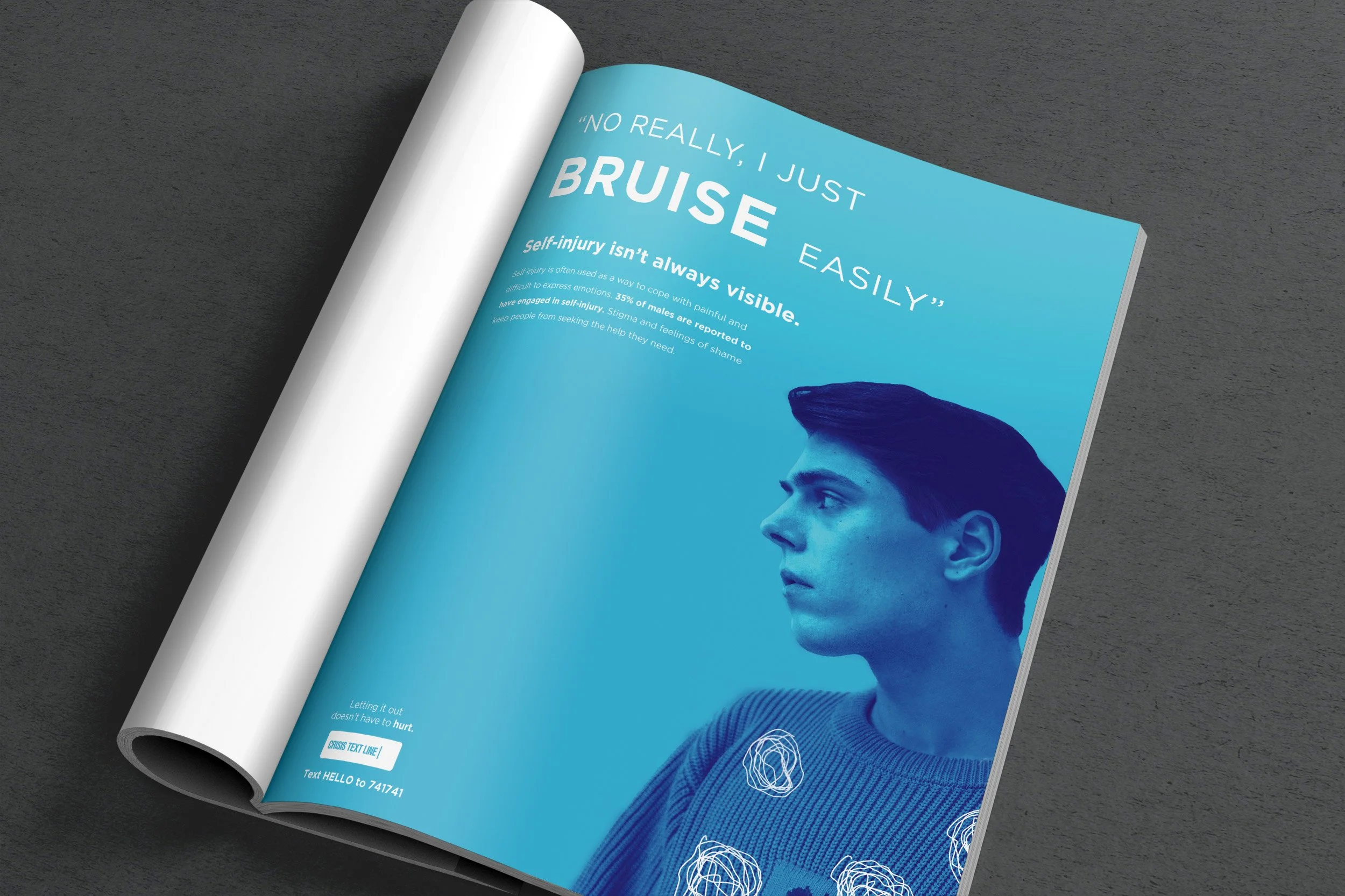
For this project, I decided to go with a simple blue gradient color scheme and use stock photography with a duotone color effect for more visual interest. For the “scars” or other images, they were drawn on in an abstract style to get the message across with a sensitivity towards the graphic nature of self-injury scars. The type is a simple sans-serif that helps get the message across. The unique marketing item that was required was a kit of items aimed at those suffering from self-injury that had various ways of coping as well as ways to reach out for help.
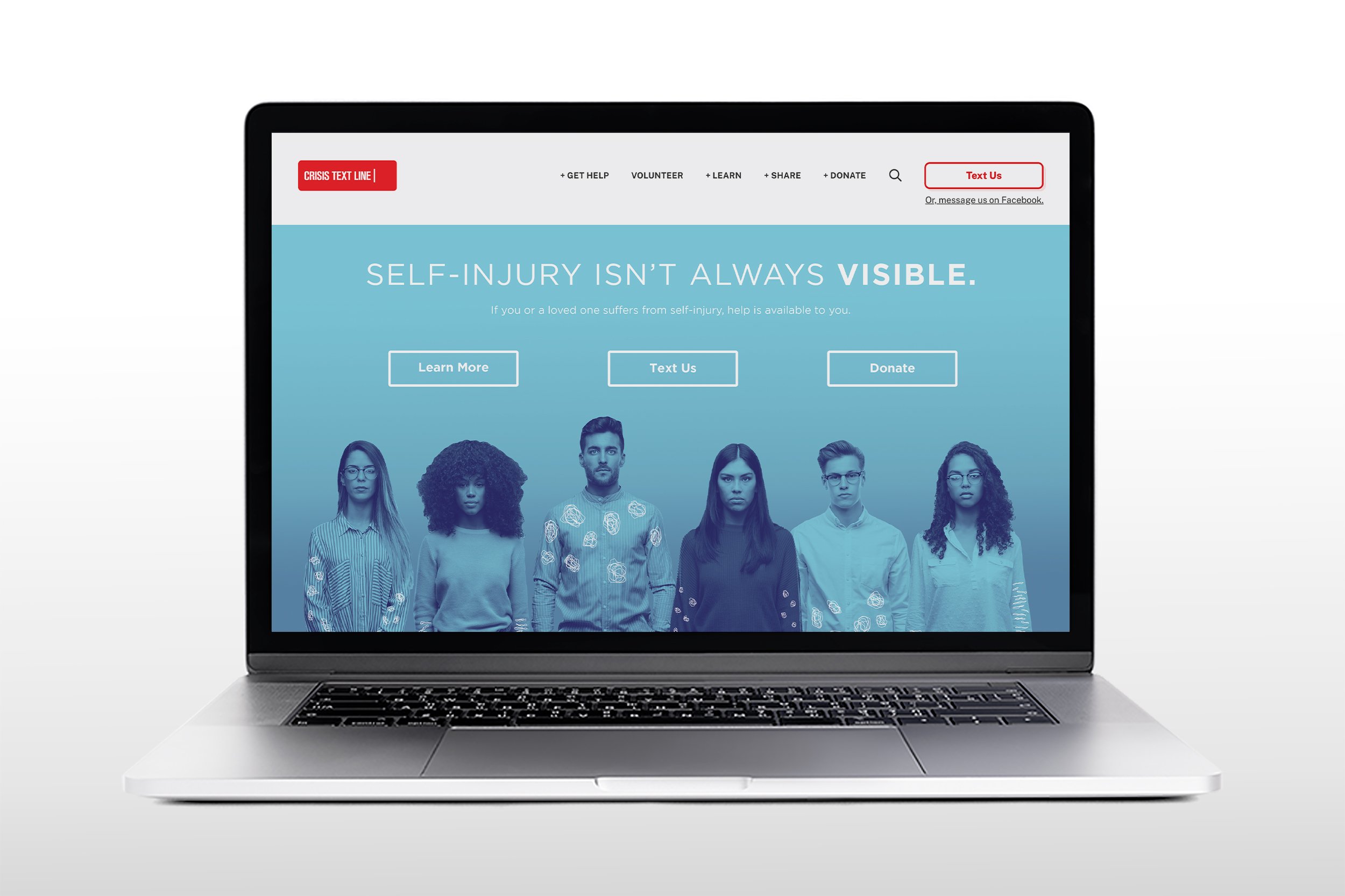
Website Landing Page
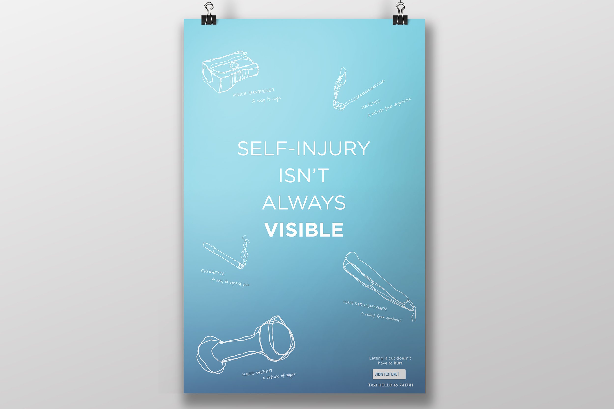
Poster
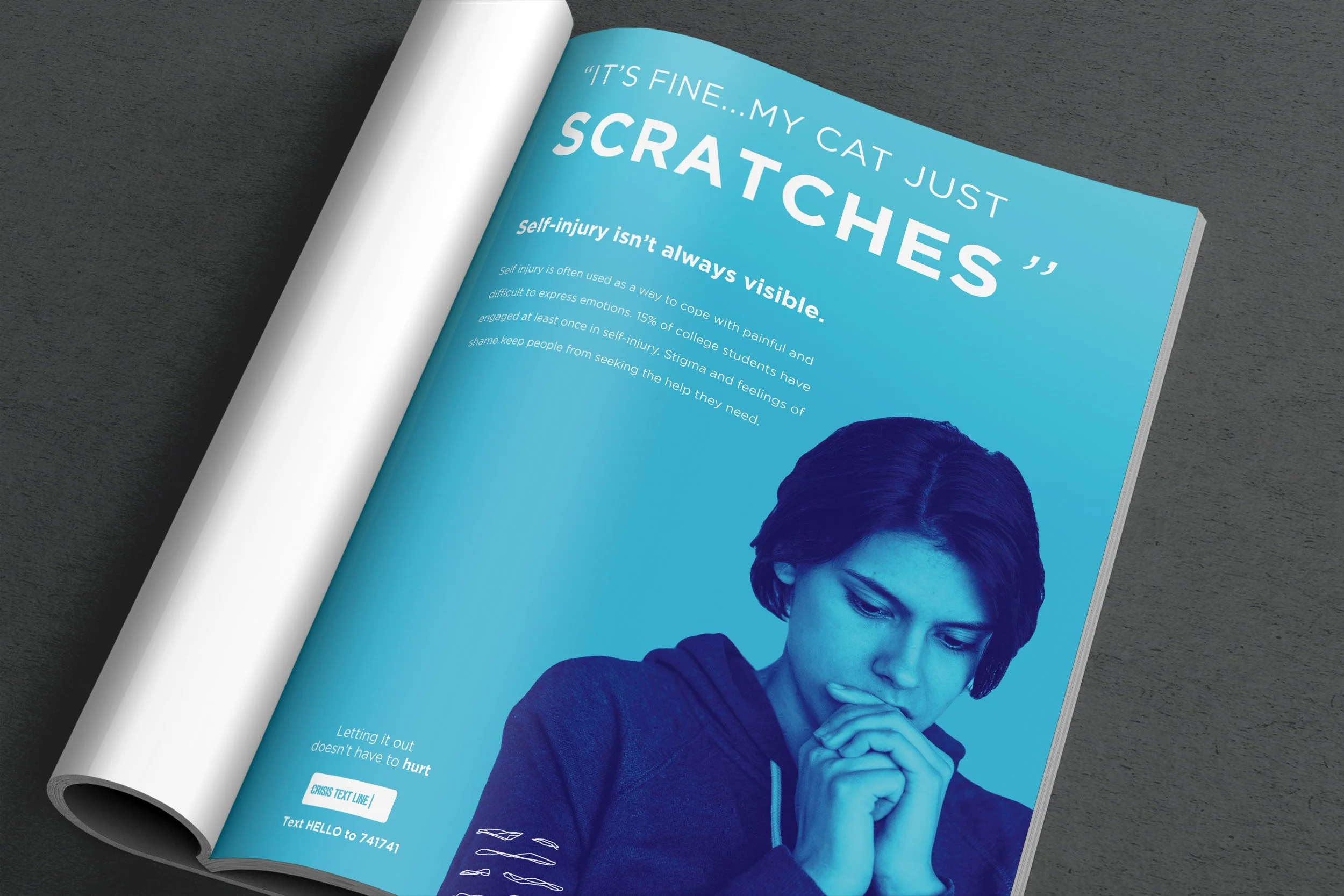
Magazine Ad 1
Magazine Ad 2
Magazine Ad 3
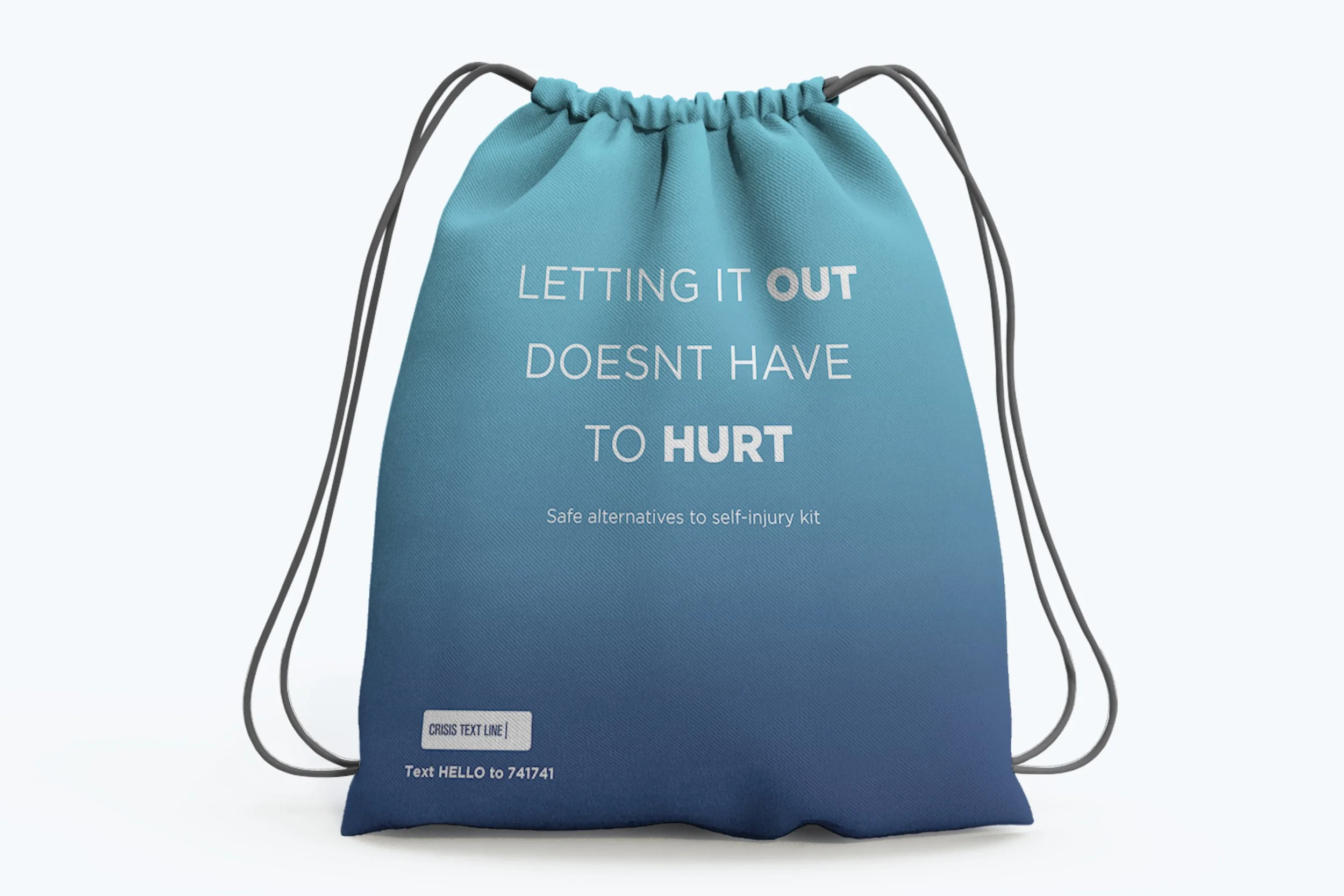
Care Kit - Bag
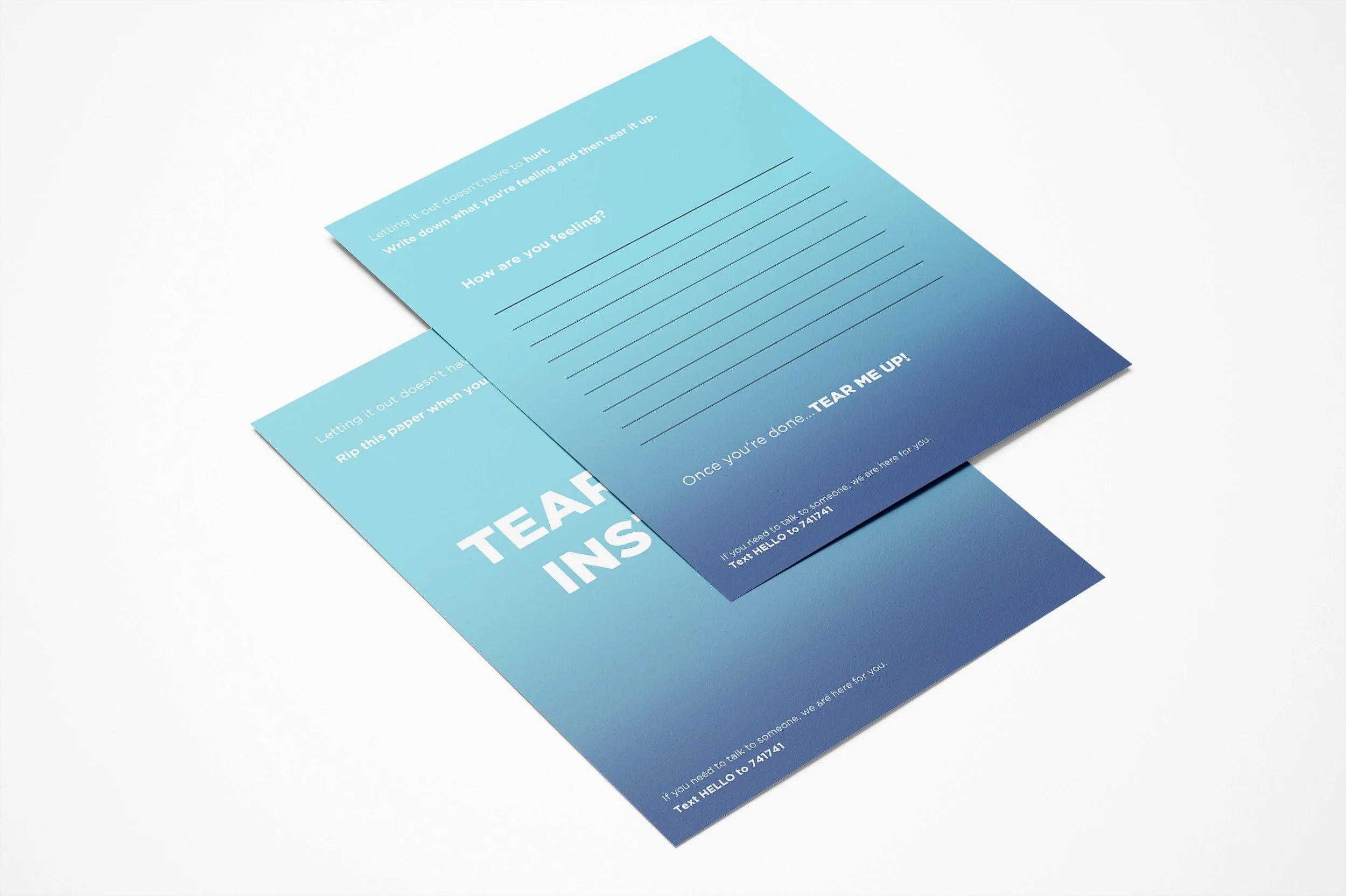
Care Kit - Write down and tear up
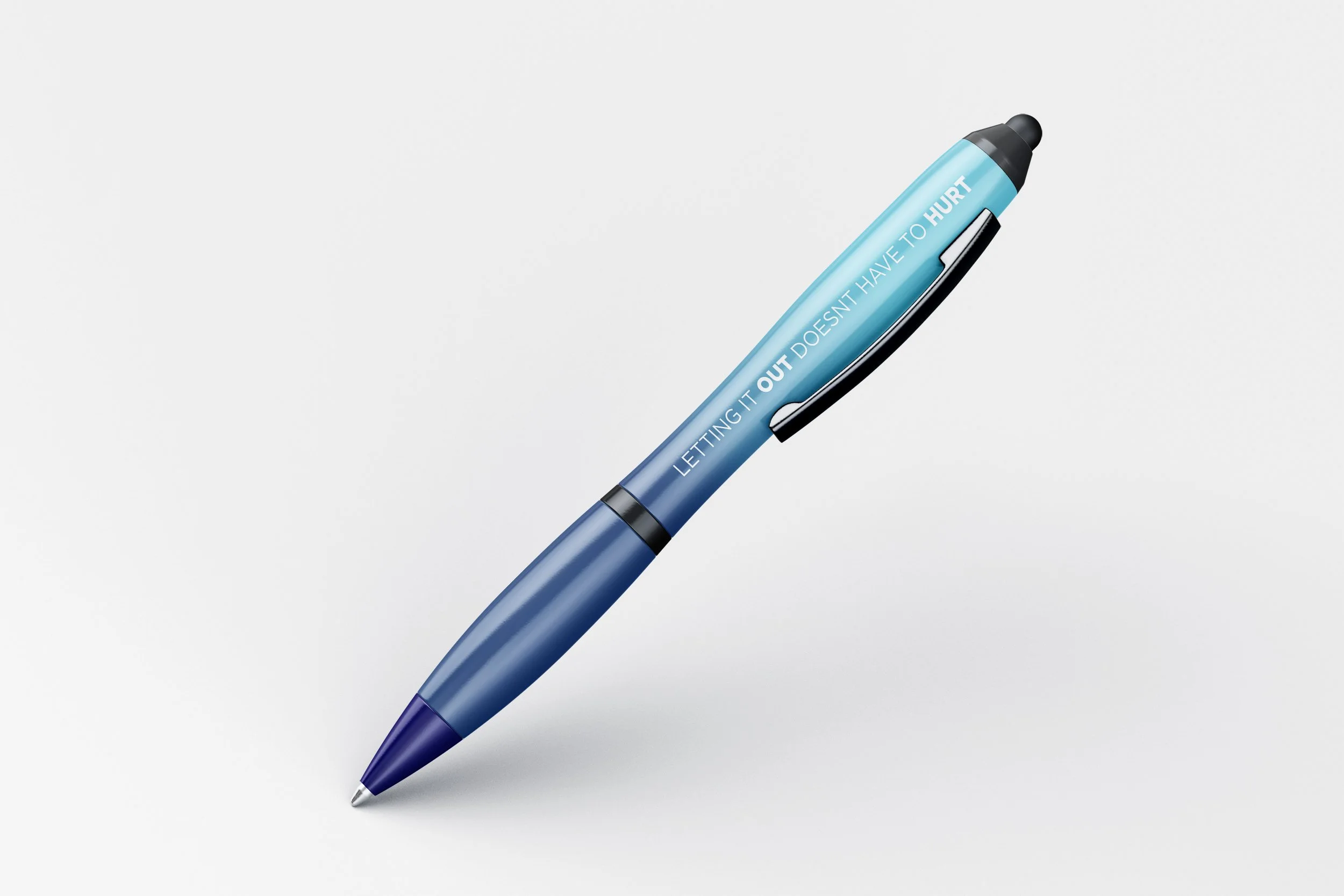
Care Kit - Pen
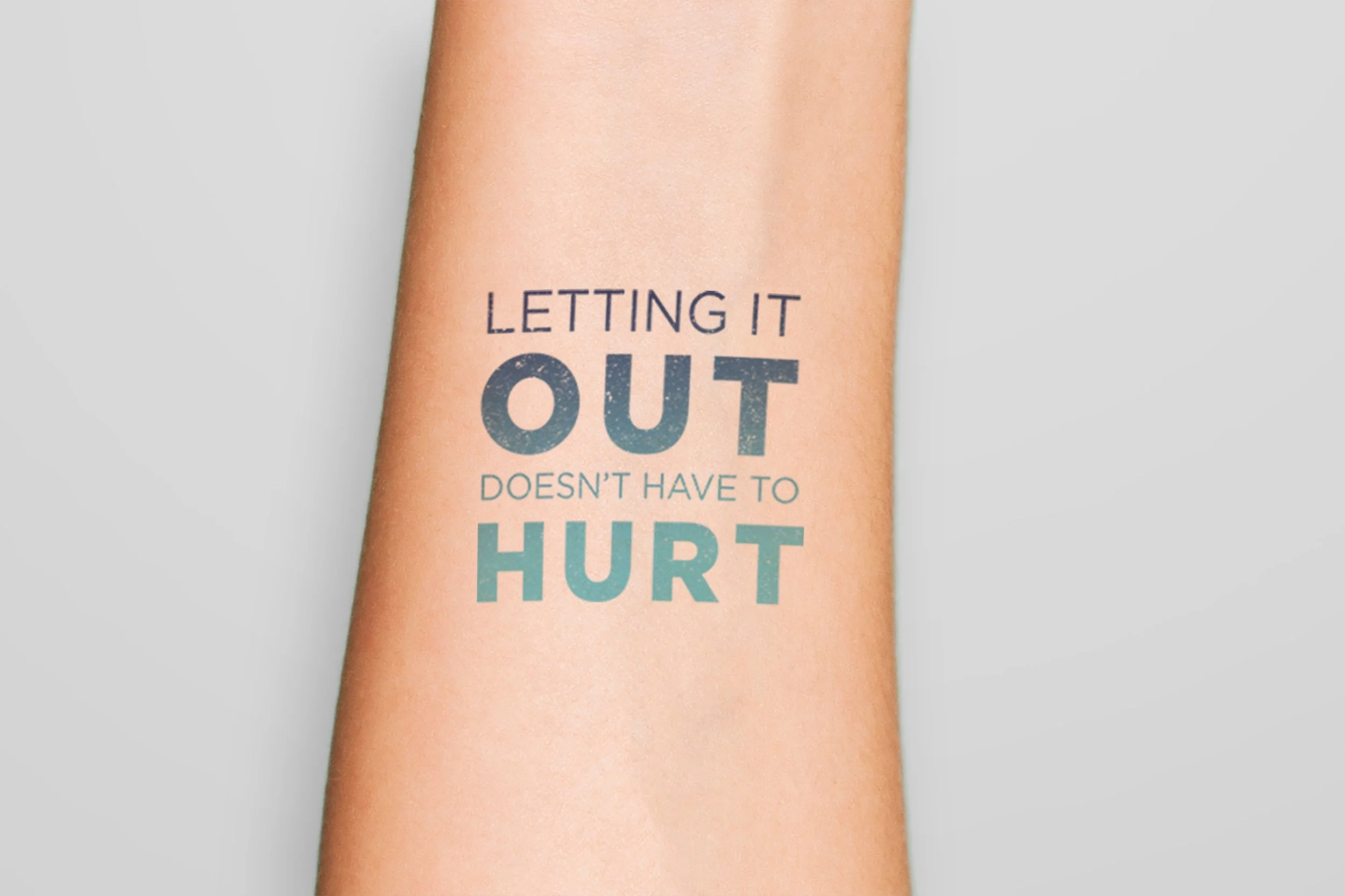
Care Kit - Temporary Tattoo
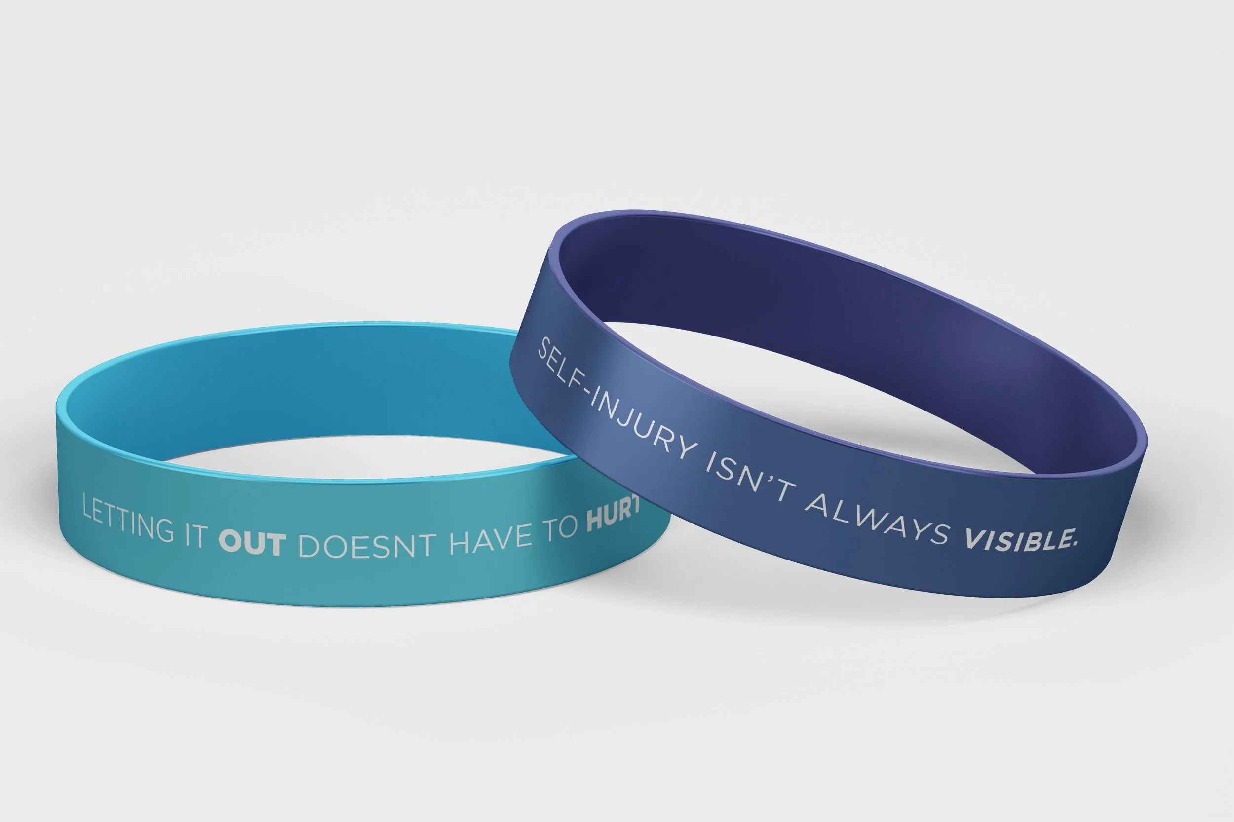
Care Kit - Wristbands
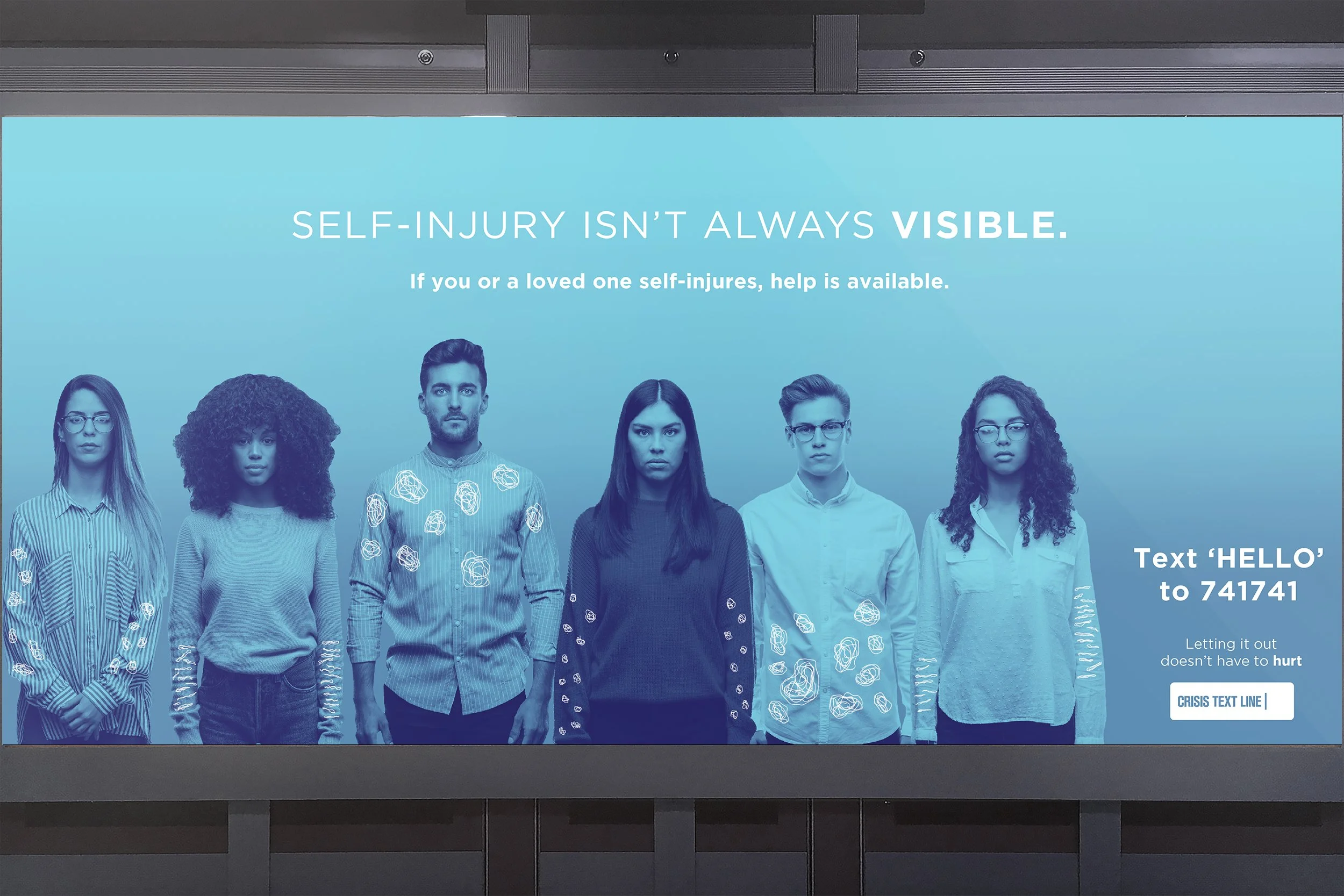
Transit Ad